
The Teapot - oil on panel (6" x 8") by Benoit Philippe
 The Louvre from the Tuileries Garden in Paris
 The Louvre from the Tuileries Garden in Paris


Parisian breakfast - oil on panel (6" x 8") by Benoit Philippe


Painting the flower petals

For the impasto on the flowers, I mixed the paint with Lefranc & Bourgeois Flemish Medium paste (clear) in tube. It is composed of mastic resin, linseed oil, Aspic spirit and cobalt-zirconium siccative. It takes quickly (2 hours) and becomes hard when dry. It is glossy and transparent and allows precise and profound brush strokes.

A thin rounded knife is ideal to paint flower petals. Note how the shape of the knife blade actually mimics the shape of the petals.

For maximum effect, the thick application of pure light colour is laid on top of the thin darker under painting (see

I have reposted the photograph of the Chrysanthemums and apples painting in a larger format, so you can see the details of the brushwork and texture created with the painting knives. To see the larger photograph, just click on the photograph in the post and the larger version will open in a new window.
Related articles
Thick lights over thin darks
Paint fat over lean – oil technique


Morning break - Oil on panel (6" x 8") by Benoit Philippe

Tools for your inventory
If you are low-tech, pen and paper work well. Just prepare a table with as many columns as necessary for the information you want to capture and photocopy your template.
On a computer, you can use a simple spreadsheet (like Microsoft Excel) or a table in a Word document (use the landscape format) to keep your inventory. The key is to keep your inventory up-to-date as you go. I learnt the hard way that trying the re-create the information several years after the facts is almost impossible.
You can also invest in a professional solution. A number of vendors propose some software that helps you to keep your inventory, but also to generate price lists, catalogues and even manage your mailing list. See Related articles below for more information on existing artist software solutions.
Some practical considerations
If you keep your inventory on your computer:
Related articles
Updated database software for artists by Alyson Stanfield from Art Biz Blog
Template for inventory record

Art inventory Art marketing Painting Art sale Art exhibition Art template Database software for artists
I don’t want to spoil the surprise for you. Just let me say that it is a hilarious take on modern art and art in general. Very Swiss.
If you have troubles with the embedded video, please visit the TED website.
Related resources
Books by Ursus Wehrli:
Tidying Up Art
More Tidying Up Art
Humour in art Ursus Wehrli Tidying up art TED Talk TED Conference
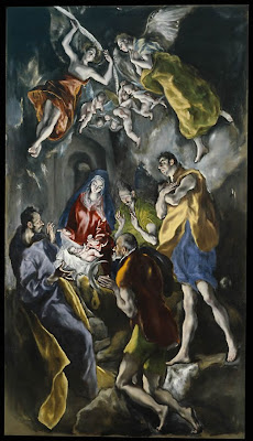

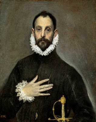
Phidias Alkamenes El Greco Perspective Art history Museo del Prado
 Yosemite's Snow - Oil on canvas (12" x 10") by Benoit Philippe
In order to get luminous colours, I painted the white canvas with a coat of vermillion acrylic paint before starting.

I would like to take this occasion to thank the following artists that have a link from their blog to mine:
Susan lives with her family in California and paint with watercolours and draw with pencils and colour pencils. You can see her works on her blog Susan’s Scribbles
(Long) Post Scriptum
You may wonder how I found about this. I know thanks to a tip that Dan, who is managing EmptyEasel, gave in his article “An Off-site SEO Tip for Online Artists (Or, The Good Karma of Linking)”.
Yahoo has a tool called Site Explorer , which allows you to know who is linking to your site. It is simple:
Yahoo Site Explorer Thanksgiving Susan’s Scribbles Chitra Karma EmptyEasel


Three plums - Oil painting (6" x 8") by benoit Philippe
Related resources
Rothko Exhibition
26 September 2008 to 1 February 2009
Tate Modern
Bankside
London SE1 9TG
020 7887 8888
Open Sunday – Thursday 10.00–18.00
Open Friday and Saturday 10.00–22.00
Rothko Art exhibition Sunday Times Tate Modern Artwork signature


La Peniche - Watercolour by Benoit Philippe - I used masking fluid to reserve the light areas on the boat as well as the sunny areas on the path and in the bushes.
With masking fluid, you are only limited by your own imagination and you will soon find ways to use masking fluid to your advantage. This is a “must have” tool in the watercolourist’s tool box. Here are some examples of uses to get you started:
Watercolour Watercolor Painting technique Masking fluid Trinket Masking gum
